
Dermatology Website Design: Why We Built It This Way
Most of the design choices on a dermatology site we rebuilt answered one question: how does a patient get from worried about a spot to a booked visit? Here is what we chose and why.
On This Page
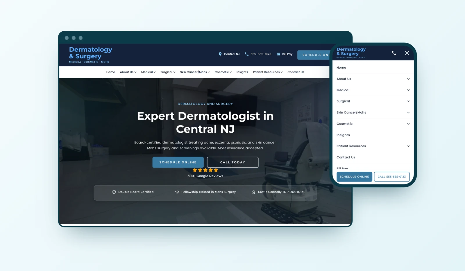
When we rebuilt the website for a central New Jersey dermatology and Mohs surgery practice, most of the design decisions were not about taste. Each one answered a specific question about how a patient finds a dermatologist, decides to trust one, and picks up the phone. Here is what we chose and why.
Quick answer: We kept the practice's existing colors and type so returning patients would recognize it, then rebuilt everything underneath around one job: getting a patient from "I need a skin doctor" to a booked visit. That meant putting the doctor and the Mohs specialty early, making every card a link, pinning Schedule and Call on phones, and loading the main photo first.
I wrote about the search results from this rebuild in how one practice tripled its local search clicks. This post is the other half: the design reasoning.
Why didn't we give the practice a new look?
Because the old look was not the problem. The practice already had a recognizable teal and two typefaces patients had seen for years. What was broken was structure: a shared domain, thin content, and a slow, plugin-heavy build.
So before designing anything, we measured the old site. We captured 118 of its pages and pulled the colors, fonts and spacing the browser actually painted, then rebuilt the new site on those same values. A patient who had been to the old site landed on something that felt familiar, while every page underneath was new.
We did the opposite for the practice group's small parent site, whose only job is sending visitors to one of two practices. That site got a new look built around that one choice. The rule I use: keep a look when patients already associate it with the practice, and change it when it is in the way.
Why does the doctor come right after the services?
Because for skin cancer, patients are choosing a surgeon, not a building. This practice's big difference is a board-certified dermatologist who is also a fellowship-trained Mohs surgeon, and the home page buried that.
In November we ran a structured design review of the home page. It scored 21 out of 36. The biggest problems:
- The doctor and the Mohs specialty showed up late in the scroll.
- The doctor's portrait linked back to the home page instead of to the doctor's profile.
- There was no Schedule or Call prompt anywhere after the top of the page.
The fix was ordering, not decoration. The doctor now sits directly under the services, the portrait and Read More go to the doctor's page, the FAQ opens with skin cancer and Mohs, and a Schedule Your Visit band with the address closes the page.
Why is every service card a link?
The services section had cards for each area of care under an "Explore" heading, and none of them were clickable. A patient who tapped "Skin Cancer" got nothing.
A card that looks tappable and is not is worse than no card, because it teaches the visitor that the page does not respond. Every card now goes to its page, along with the Mohs trust item. It is the least glamorous change on this list and probably the one patients feel most.
Why are Schedule and Call pinned in the phone menu?
Because a lot of people looking for a dermatologist nearby are on a phone, and the two things they want are booking and calling. The old phone menu was a side drawer with small tap targets: 36 of the 58 targets on the home page were under 44 pixels, the minimum size Apple recommends for something you tap.
The new menu is a full panel under the header with Schedule and Call pinned along the bottom, right under your thumb, no matter how far you scroll the list. The header tucks away as you scroll down to read and comes back the moment you scroll up, so it never covers the content but is always one flick away. A call bar appears while reading and no longer sits on top of the footer.
We also fixed the call buttons themselves. 114 "Call Today" buttons across 86 pages showed only a label, with no phone number in the button. Google's call tracking swaps the number it can see, so calls from those buttons were not being counted as ad conversions. Each one now carries the number, hidden from view, and the practice can finally see which ads drive calls.
Why three short reviews instead of a carousel?
A scrolling carousel of long testimonials looked busy and pushed the page taller. We replaced it with three five-star Google reviews of about the same length, quoted word for word, with stars and no side scrolling. On desktop the section went from 875 pixels tall to 515.
The review count above them comes straight from the practice's Google listing, which had 307 reviews at 5.0 when we checked, so the site says "300+ Google Reviews." We used the practice listing only, not the doctor's separate listing, so the number on the site matches what a patient sees on Google.
Why did the text get bigger?
Many dermatology visitors are reading about a spot they are worried about, often on a phone. Small, light text is a bad fit for that moment.
Body text is now one size across the whole site: 16 pixels on desktop and 15 on phones, with the home headline capped at 54 pixels so it does not crowd small screens. Form fields stay at 16 pixels on phones. That number matters: an iPhone zooms into any form field smaller than 16 pixels when you tap it, which throws the patient off the page halfway through filling in their details. Some of the intake fields were at 14 pixels before.
Why does the main photo load before anything else?
Because the first photo is what tells a patient they are in the right place, and on the old setup it was waiting behind four slideshow photos that do not appear until six seconds in.
We changed the loading order, not the design. The slideshow photos now load after the page is up, phones get a cropped version of the main photo that is about half the size, and the logo and badges come in sized for the screen. We compared the page pixel by pixel at six screen widths before and after, and the layout did not move.
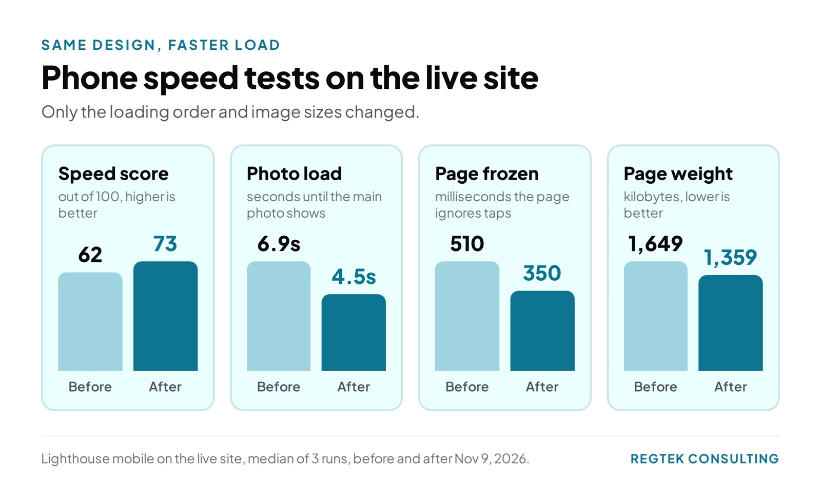
The chart has the live numbers, each the median of three phone tests. Speed tests vary run to run, so read them as a direction, not a promise.
Why is the physician assistant never called a dermatologist?
Because New Jersey law says so, and because it is the honest thing to do. The New Jersey Health Care Transparency Act requires any advertisement that names a health care professional to state that person's license type, and it bars misstating their training. A practice website counts.
So the practice's physician assistant is always "PA-C, physician assistant" on the site. People do search for a "female dermatologist," and the PA's page answers that search honestly, with the real credential. A design system is also a set of rules about words, and this one is written into the site.
What this means for your practice
None of these decisions came from a trend. Each one came from asking how a real patient uses the page: who are they choosing, what do they want to tap, what are they reading on, and what slows them down. If your website has a look your patients know, you may not need a new one. You may need the doctor higher up, cards that actually go somewhere, a phone menu built around Schedule and Call, and a main photo that loads first. If you want a second opinion on yours, I am happy to look at it with you.
Frequently Asked Questions
Should a dermatology practice redesign its website's look when it rebuilds?
Not by default. If patients already recognize the colors and type, keeping them protects that recognition. Rebuild the structure, speed and booking path first, and change the look only where it gets in the way.
What should be at the top of a dermatology home page?
The services and, right after them, the doctor, with their credentials and specialty, such as Mohs surgery. Patients choosing a dermatologist for a skin cancer concern are choosing a person, so the person should not be buried.
Why do form fields need to be 16 pixels on phones?
On an iPhone, tapping a form field smaller than 16 pixels makes the browser zoom in, which pushes the rest of the form off the screen. Keeping fields at 16 pixels avoids that.
Do call buttons on a medical website need the phone number in them?
If you run Google Ads with call tracking, yes. Google swaps the phone number it can find on the page. A button that only says "Call Today" has no number to swap, so calls from it are not counted.
Sources
Ready to see results for your practice?
30-minute strategy call. Straight to Kevin, no account managers.
Request a free 30-minute callReady to see results for your practice?
30-minute strategy call. Direct access to Kevin Dillon, who ran operations for a five-office clinic. No account managers, no pitch deck, just answers.
Request a free 30-minute callMore insights
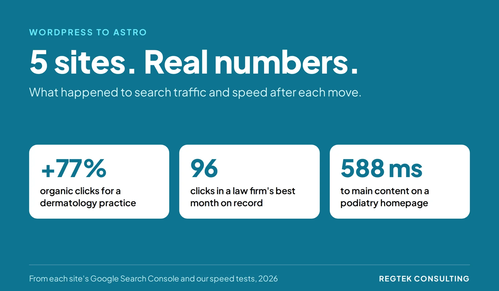
WordPress to Astro: Real Results From 5 Sites
Astro vs WordPress, with data instead of opinions: what happened to search traffic, leads and speed on five sites we moved off WordPress and Wix, and the migration steps behind the results.

New Website or Fix the One You Have? How to Decide
Not every practice that wants a new website needs one. One check shows whether to fix the site you have or rebuild it.

Healthcare SEO: Service Pages or Condition Pages?
Should a healthcare practice build a service page or a condition page? Use a patient-first framework to choose, link, and measure the pages that matter.