
Healthcare CRO: Turn Visitors Into Booked Patients
Healthcare websites typically convert just 1.5% to 3% of visitors, while top performers hit 6% to 12% on identical traffic. This pillar guide shows exactly where the gap lives and how to close it.

On This Page
Most practice websites are leaky buckets. You spend on Google Ads, you climb to page one for your top service queries, you pay a vendor for fresh content every month, and yet the vast majority of visitors leave without booking an appointment, picking up the phone, or filling out a form. At Regtek Consulting, in our experience auditing medical, dental, and aesthetic practice sites, the pattern is depressingly consistent: traffic is fine, conversion is broken. This pillar guide walks through what a healthy healthcare website conversion rate actually looks like, where most practices bleed leads, and the specific UX, copy, and testing moves that turn passive browsers into booked patients.

Healthcare Website Conversion Rate Benchmarks (And Why Yours Is Probably Low)
The typical healthcare website converts in the low single digits (a booked appointment, lead form, or qualified phone call), while the top quartile of practice sites runs several multiples higher on similar traffic. The math matters: doubling conversion is functionally identical to doubling your ad budget, except it costs nothing per click. At Regtek Consulting, we treat conversion rate optimization healthcare programs as the single highest-leverage marketing investment most practices ignore.
What Counts as a Conversion in Healthcare?
Before you benchmark anything, you need a clear definition. For most practices, a conversion is one of four actions: a booked appointment through an online scheduler, a qualified phone call lasting more than 30 seconds, a new patient form submission, or a chat conversation that ends in a scheduled visit. Newsletter signups, PDF downloads, and service-page bounces do not count. We see practices celebrating lead growth that turns out to be mostly job applicants and vendors, which is why we always pin conversion definitions to revenue-producing actions before any audit begins.
Industry Benchmarks: Where Most Practices Land
Across paid search and organic landing experiences, healthcare and medical services routinely report some of the lowest conversion rates of any vertical. According to industry benchmark data tracked and discussed by Search Engine Journal, paid search conversion rates in medical and dental categories often sit in the low single digits, well below sectors like legal services or auto repair. Organic landing pages tend to perform a bit higher because intent is stronger, but the spread between average and top-quartile sites is enormous, often several multiples on the same traffic.
Why Medical Sites Underperform Other Industries
Three structural reasons. First, most practice sites are built by general web vendors, not conversion specialists, so they prioritize aesthetics over decision architecture. Second, medical content is inherently anxious, and anxious users abandon faster when a page is slow, cluttered, or vague. Third, insurance, scheduling, and intake friction are real, and they leak conversions even when copy and design are great. We dig deeper into why healthcare websites lose 97% of visitors in our companion analysis, but the short version is straightforward: structural problems require structural fixes, and a redesign alone almost never solves them.
Schedule Your Free Strategy Call
Why Healthcare Websites Lose Visitors: The 7 Most Common Conversion Killers
Most healthcare sites lose visitors to a predictable set of friction points: slow mobile load times, weak above-the-fold value propositions, hidden phone numbers, long intake forms, vague insurance pages, no scheduling option after hours, and a complete absence of trust signals near the action. Fix even three of these and conversion typically lifts noticeably, with no redesign required.
Friction Points You Can Spot in 5 Minutes
Open your homepage on your phone using cellular data, not office wifi. Time it. If it takes longer than three seconds to render the hero, that alone is costing you patients. Then look for the phone number. Is it a tap-to-call link in the header? Or is it static text in the footer? Now scroll to the appointment form and count the fields. If there are more than five required fields, you are filtering out warm leads and keeping only the patients who would have booked anyway. We walk through the full diagnostic in our breakdown of the 7 conversion killers on healthcare sites, with screenshots of the most common offenders.
Hidden Killers in Your Analytics
The killers you cannot see in a 5-minute walkthrough live in your analytics. High exit rates on the insurance page mean coverage anxiety is bouncing patients before they ever consider booking. A click-to-call rate under 2% on mobile means your phone CTA is effectively invisible. Form abandonment that spikes at the third or fourth field means you are asking for information that should be collected after the appointment is booked, not before. Set up event tracking for these specific moments. Without that visibility, you are optimizing blind.

Medical Website UX: The Design Principles That Build Trust and Drive Action
Here is the uncomfortable truth about most medical website UX: it is designed to make the practice owner feel proud at the launch meeting, not to help an anxious 47-year-old on a phone in a parking lot decide whether to call. Those are different jobs, and almost every site we audit is optimized for the first one. The fix is not prettier , it is more honest about what the visitor is actually trying to do in the next ninety seconds, and removing everything that gets in their way.
Trust Signals That Matter to Anxious Patients
Stock photos of smiling models in white coats are worse than no photos at all. Anxious patients spot generic imagery instantly, and it triggers the opposite of trust. What works in our experience: real headshots of the providers, board certification badges placed near each practitioner name, a count of years in practice, a count of procedures performed, and a small block of three to five recent verified reviews placed near the booking CTA, not buried on a separate testimonials page. Trust is local and specific, so reviews must be associated with named providers and the exact service the visitor came to research.
Visual Hierarchy and Scannability
On a medical homepage, the visitor's eye lands in three places in the first two seconds: the top-left logo, the largest text in the hero, and whichever button has the highest color contrast. Everything else is wallpaper. So the question is not whether your hierarchy follows an F-pattern , it is whether the three things the eye actually finds answer the visitor's only real question: can these people fix what is wrong with me, and how do I start? When rebuilding a practice homepage, the first cut is almost always the same: kill the rotating hero carousel, kill the founder welcome video, kill the three-paragraph mission statement, and replace all of it with a single outcome-led headline, a sub-line naming the condition or service, and one button. Page weight drops, the eye stops hunting, and the booking CTA finally gets a fair fight.
Accessibility Is Not Optional
ADA accessibility is both a legal requirement and a conversion lever. Insufficient color contrast, missing alt text, tiny tap targets, and forms that cannot be navigated by keyboard exclude a meaningful slice of your audience and create real legal exposure. Practices have been sued for inaccessible sites, and that risk is rising every year. Beyond compliance, accessible sites convert better for everyone because the same things that help screen reader users (clear labels, logical structure, generous tap targets) also help every patient holding a phone in a noisy waiting room.
Doctor Website Conversion Tips: Small Changes That Move the Needle
You do not need a full redesign to lift conversion. The highest-ROI doctor website conversion tips are usually small: a sticky mobile CTA, a tap-to-call button in the header, a five-field intake form, an exit-intent offer for a free consultation, and value-led copy on service pages instead of clinical jargon. We see practices meaningfully improve their booking rate from these alone, before they ever touch the visual design.
Quick Wins You Can Ship This Week
A short list of changes that almost always pay off:
- Add a sticky bottom-bar CTA on mobile with two buttons: Call Now and Book Online.
- Move the phone number from the footer to the header, formatted as a tap-to-call link.
- Replace homepage carousels with a static hero, a clear value statement, and a single primary CTA.
- Add a What to Expect section to every service page to reduce first-visit anxiety.
- Place a verified review block within view of the booking CTA, not three sections below it.
- Strip secondary navigation off paid landing pages so the only path forward is conversion.
Form Field Reductions That Actually Work
Every required field on an intake form costs you completed submissions. The trick is to ask for what you need to schedule, not what you need to chart. Name, phone, preferred time, and reason for visit are usually enough. Date of birth, insurance carrier, and full address belong in a confirmation step or post-booking intake, not the first contact form. If your front desk team complains that fewer fields means lower-quality leads, the issue is almost always qualification, not form length, and we cover that gap in our analysis of why your marketing leads aren't converting.
Copy Patterns That Convert
Replace Welcome to Our Practice with what the patient actually wants to know in the first three seconds: what you treat, who you treat, how to book, and why you are different. Lead service pages with the patient outcome, not the procedure name. Get Back to Running Pain-Free beats Spinal Decompression Therapy every time as a headline, with the clinical name as the supporting subhead. Specificity wins over polish.

CRO for Medical Websites: How to Run A/B Tests Without Breaking Compliance
You can run rigorous experiments on a healthcare site without violating HIPAA, ADA, or state advertising rules, but the constraints are real. PHI cannot enter your analytics or testing tools, advertising claims must remain truthful and substantiated, and accessibility cannot regress through a variant. We are publishing a deeper guide on CRO for medical websites soon, but here is the short version of what works in practice today.
What's Safe to Test (And What Isn't)
Headlines, button copy, button color, hero imagery, social proof placement, CTA position, form length, and pricing transparency blocks are all fair game. What you cannot test is anything that would make protected health information visible to a third-party tool, anything that would surface a clinical claim you cannot substantiate, or anything that would degrade accessibility for screen reader users. As a rule, if a variant requires you to ask whether it is still HIPAA compliant, the answer is to stop and consult counsel before launching the test.
HIPAA-Conscious Tooling
Standard analytics and heatmap tools can be configured to mask form inputs and exclude logged-in patient portal pages from tracking. Server-side tagging through Google's tag platform documentation is the cleanest way to keep PHI out of third-party pipes, since you control what is forwarded and what is dropped at the server layer. Signed BAAs are non-negotiable for any tool that touches authenticated patient data, which is why we keep testing strictly on the public marketing site and never on portal or scheduling-confirmation pages.
Sample Size Realities for Small Practices
A single-location practice with a few thousand monthly visitors and a 3% conversion rate will almost never reach statistical significance on a button-color test in under three months. That does not mean testing is pointless; it means you should test bigger differences (full hero rebuilds, full form rebuilds, scheduling widget swaps) on the highest-traffic pages, then ship the winner and move on. Save micro-tests for when you have multi-location traffic or paid campaigns driving thousands of sessions per variant.
Healthcare Landing Page Design: What Actually Makes Patients Pick Up the Phone
A high-converting medical landing page does five things in the first viewport: names the patient problem, names the outcome, shows proof, removes objection, and offers one clear next step. Everything else is optional. Our deeper breakdown of healthcare landing page design: what actually makes patients pick up the phone walks through the full anatomy with examples drawn from common patterns we see across practice sites.
The Anatomy of a High-Converting Medical Landing Page
The pattern that consistently works:
- Headline: outcome-led, includes the condition or service.
- Subhead: who it is for and the differentiator.
- Primary CTA: above the fold, single action (call or book).
- Trust block: provider photo, credentials, recent review snippet.
- What to expect: 3 to 5 bullets on the actual visit experience.
- Insurance and pricing transparency block.
- FAQ that resolves the top three objections you hear at the front desk.
- Repeated CTA at the bottom with both phone number and form.
One Page, One Goal: Eliminating Distraction
Paid traffic landing pages should not carry full site navigation. Strip the menu down to a logo and a phone number. Every additional link is a chance for the visitor to wander off without converting. This single change often produces a meaningful lift on its own, especially for high-cost campaigns where every click is paid for and every distraction is a refund the patient never owed you.
Scheduling Widgets vs. Phone vs. Form
There is no universal answer. In our experience, older demographics and high-anxiety services (oncology, neurology, chronic pain) convert better on phone-led pages with a prominent tap-to-call button. Younger demographics and elective services (medspa, dermatology, cosmetic) often convert better on embedded scheduling widgets that show real availability. Forms work as a fallback for after-hours capture. The right answer is to offer all three and let the patient choose, but lead with the modality that matches your dominant patient population.
Bringing It All Together: Building a Conversion-Focused Practice Website
Here is what separates the practices that compound conversion gains from the ones that audit once, ship a flurry of fixes, and quietly drift back to baseline a year later: somebody owns the number. On the winners, conversion rate is a line item in a monthly operations review, with a named owner, a dashboard the front desk and the marketing vendor both look at, and a standing thirty-minute meeting to decide what gets tested next. On the losers, the audit lives in a PDF, the quick wins ship once, and the website goes back to being whatever the web vendor felt like updating. Treat your site like a piece of capital equipment , you would not buy a $250,000 imaging machine and never recalibrate it. The website is the same asset, and it deserves the same operating cadence: measure, fix, test, repeat.
The 90-Day CRO Roadmap for Healthcare Practices
A simple sequence we use as a digital marketing consultancy working with practice owners:
| Phase | Focus | Outcome |
|---|---|---|
| Days 1 to 30 | Audit and instrument: define conversions, fix tracking, baseline benchmarks. | Clear visibility into where leads leak. |
| Days 31 to 60 | Ship quick wins: sticky CTAs, form reduction, mobile speed, trust blocks. | Measurable lift in conversion rate. |
| Days 61 to 90 | Test and iterate: A/B test top landing pages and the homepage hero. | Compounding gains and a repeatable testing pipeline. |
The practices that win on conversion are not the ones with the prettiest sites. They are the ones that treat their website like an operating asset: measure it, fix the leaks, and keep testing every quarter.
Sources
Ready to Convert More of the Visitors You Already Have?
Every percentage point of conversion left on the table is real patients walking past your front door each month. At Regtek Consulting, our team helps medical, dental, and aesthetic practice owners fix the structural leaks first, then build a testing program that keeps lifting bookings quarter after quarter. If your traffic is healthy but your phone is quiet, the gap is almost always conversion, and it is fixable.
Frequently Asked Questions
What is a good conversion rate for a healthcare website?
A healthy healthcare website converts 6% to 12% of visitors into booked appointments, qualified phone calls, or completed lead forms, while typical practice sites convert just 1.5% to 3%. Doubling your conversion rate delivers the same revenue impact as doubling your ad spend, without paying for additional clicks or impressions.
What are the most common conversion killers on medical practice websites?
The biggest conversion killers are slow page loads, unclear calls-to-action, hidden phone numbers, multi-step booking flows, missing trust signals, weak service-page copy, and mobile experiences that bury appointment buttons below the fold. Fixing these seven friction points typically lifts conversion 50% to 200% within 90 days without touching ad budget.
How do I run conversion rate optimization without violating HIPAA compliance?
You can run aggressive CRO without breaking compliance by avoiding patient health data in tracking pixels, using HIPAA-compliant scheduling tools, masking PHI in form analytics, and never including condition-specific testimonials with identifiable details. Focus testing on layout, copy, and CTAs, not on patient data capture or condition-level personalization.
How long does conversion rate optimization take to show results for a medical practice?
Most practices see measurable conversion lift within 30 to 60 days of implementing core fixes like clearer CTAs, faster load times, and visible phone numbers. A full 90-day CRO roadmap covering audit, prioritized testing, and iteration typically doubles baseline conversion on practice sites with adequate organic or paid traffic.
What should a high-converting healthcare landing page include?
A high-converting healthcare landing page leads with a benefit-driven headline, displays the phone number and online scheduler above the fold, includes 2 to 3 trust signals like credentials and reviews, answers the top patient objection directly, and uses a single primary call-to-action. Avoid navigation menus that pull visitors away from booking.
Why are 97% of visitors leaving my practice website without booking?
Most visitors leave because the path to booking is buried, slow, or unclear, not because they lack interest. Practice sites typically hide phone numbers in headers, force visitors through three clicks to reach scheduling, lack mobile-optimized buttons, and fail to address the top patient concerns at the moment of decision.
Is conversion rate optimization better than spending more on Google Ads?
Conversion rate optimization usually delivers higher ROI than additional ad spend because every percentage point of lift compounds across all traffic sources: paid, organic, and direct. Doubling your conversion rate from 2% to 4% is mathematically identical to doubling your ad budget, but the gains persist without ongoing per-click cost.
Ready to see results for your practice?
30-minute strategy call. Direct access to Kevin Dillon, an operator who's scaled healthcare businesses to Inc 5000. No account managers, no pitch deck, just answers.
Book a Free ConsultationMore Tips & Tricks

Construction Daily Report App Case Study: One Field Hub for Reports, Safety, and Photos
We built a daily operations app for a heavy civil contractor: daily reports, safety forms, and job photos in one place, built for bad signal and connected to Microsoft 365. Here is what we built, what 780 real reports taught us, and what this case study cannot prove.

Podiatry Google Ads Case Study: 835 Patient Actions at $26 Each
An anonymized sole-provider podiatry practice used separate Google Ads campaigns to control demand across two offices, generating 835 tracked new patient actions at a $26.06 blended cost per action.
Healthcare Website Redesign: How One Practice Tripled Local Search Clicks
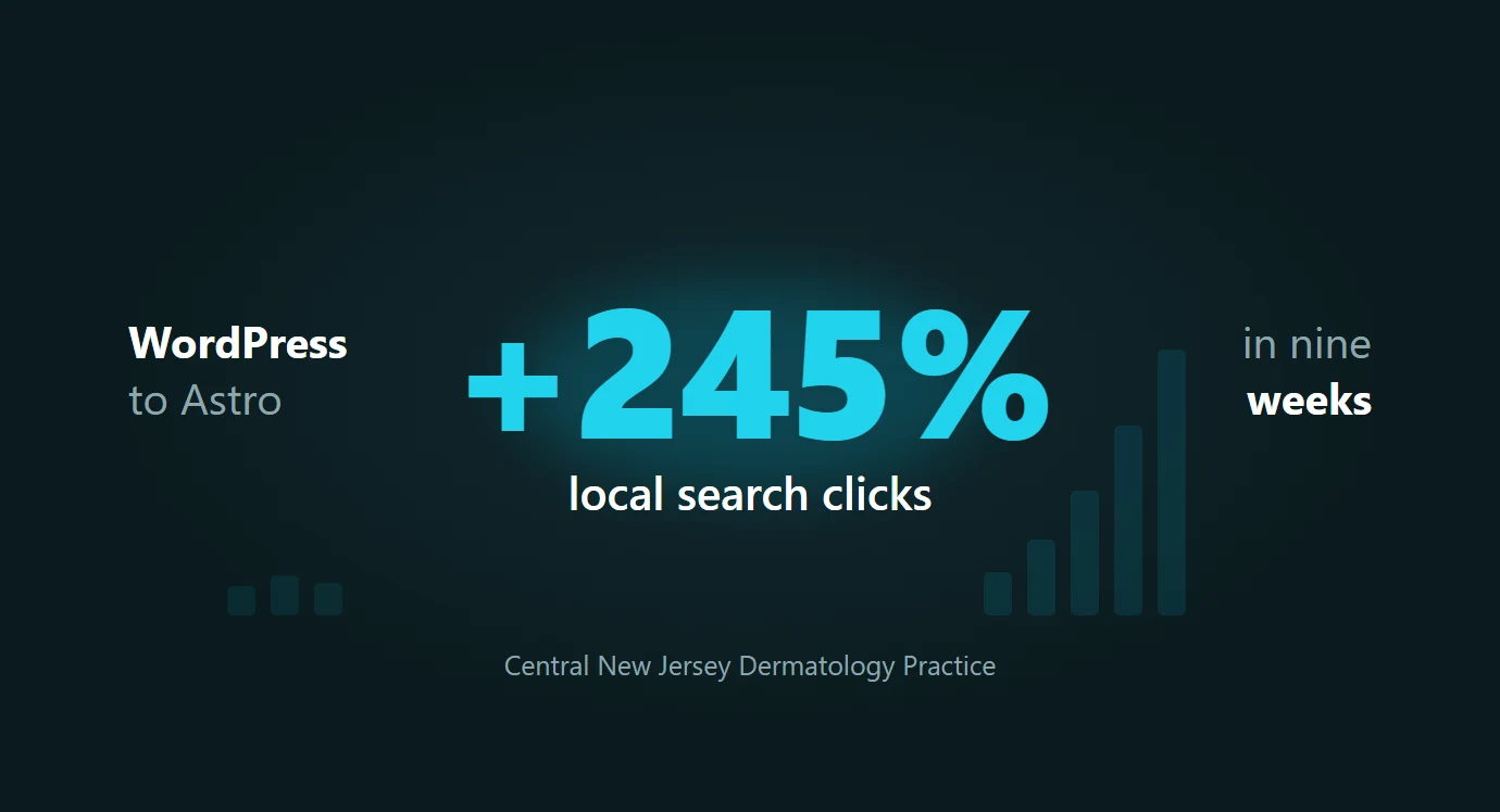
A central New Jersey dermatology practice was a subfolder on a WordPress domain it shared with a sister podiatry practice. Nine weeks after its redesign launched on a dedicated site, organic clicks were up 77% and local search clicks had tripled. Here is the full data from both Search Console properties.